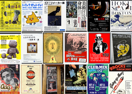
Various posters on Flickr
Signs and posters are short and sweet
A sign or a poster has a very specific function – to clearly communicate a (usually limited) set of information in a way that both attracts attention and can be read in a fairly short period of time. A poster for a book launch does not include the text from the book. Many warning signs have only one single word.
The principles here also apply to web banners and email mailers.
Common sign and poster fails
Common design fails are:
Too much or too little or missing information
Poor or non-existent hierarchy of reading
Illegible type or other design problems that interferes with reading
Not accounting for the display context
Understand the hierarchy of reading
The hierarchy of reading is the interplay between how information is prioritised on a page, and how our eyes typically scan a page. It affects how we well and quickly we can comprehend the information presented in a piece of design.
We can prioritise the more important elements on a page by making them larger, use brighter colours, and create stronger contrast relative to the rest of the page. The reverse is true for the less important elements.
We can also focus attention on the more important elements of a design by placing them in locations on the page where the human eye will tend to scan first and linger on.
The layout of newspapers is a great illustration. We know what is the most and least important element to look at from the design.
Two of the most favoured positions on a page are the top left corner and the bottom right corner. These are the locations where you tend to find headlines and logos typically. The least favoured area is the bottom left corner. This tends to be where the fineprint is placed.
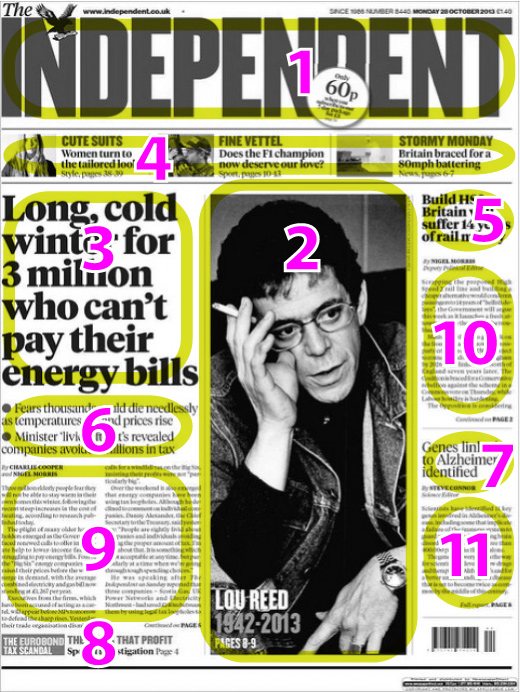
Source: El cromaticôm, CC BY 2.0, via Flickr
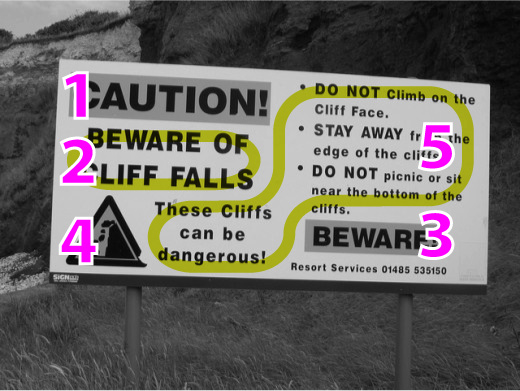
Source: Elliott Brown, CC BY 2.0, via Flickr
The information elements of signs and posters
Before you start to design a sign or poster, or when you are evaluating one, it can be helpful to group the information into the following order of prominence. Use this to check that the design and placement of elements correctly support this hierarchy.
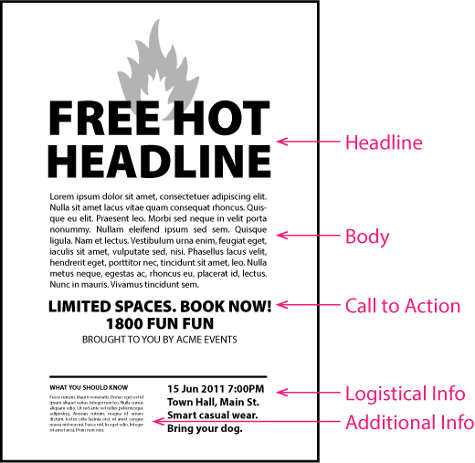
1. The headline – The headline should describe the core benefit for the reader. This key message should be as short as possible. This (in combination with the overall design) is what will attract the initial attention. Generally the headline should appear at the top left, or across the top of the page.
2. Call to action and author – The call to action is what the reader is encouraged to do in response to the information on the poster. This needs to be clear and unambiguous. Important information like dates and locations should appear nearby. It should also read naturally as a flow-on from the headline, as the reader may not read anything else on the page. This should appear below the headline towards the bottom right hand corner. This is also where your organisation’s name and logo should appear.
3. The body – This is the main bulk of the descriptive information you wish to convey. It expands on the information that may only be hinted-at by the headline. This information usually appears below the headline, and can occupy the middle of the page. The majority of the visual material like images will also appear in this area.It is generally good practice to keep this to a minimum to stop the design becoming overwhelmingly busy.
4. Additional supporting information – Identification, logistical and contact information. Times, dates, fineprint, logos and such details. Additional reassurances if the reader is still reading
5. Logistical information – Side-effects of "Speedy and Sleepless" and approval badges. Terms and conditions Disclaimers, trademark claims, copyright statements.
Function before "look"
Or as some designers like to say: "form follows function."
Good visual communications is much more than making "pretty" pictures. A sign or poster is not a piece of art. It must first and foremost communicate what you need to communicate. In some cases, a sign can mean the difference between life and death.
Check for legibility
The easiest way is to post a sample of the design, at actual size, on the wall. Then stand back at the expected reading distant, and see if you can read all the important information. If you cannot get the complete design at actual size (if the final design is very large for example), you can print out a portion of it at the actual size and check that. Choose a portion containing elements that could be most easily rendered illegible; such as the smaller type size. Most PDF viewers should let you print out a portion of the design at actual size.
If you design is intended to be read on the move – such as a sign in a traffic area – you will also need to check the legibility by walking past your wall posted sample.
Check the display context
If the design is intended to go on the side of a van, see the sample on an actual van. There may be unavoidable seams and cuts that interfere with reading.
Will the design be shown in a darkened interior like a night club? Or under bright sun next to a swimming pool? Check that colours and contrast are suited to the intended environment.
Not absolute rules
At the end of the day, the checklist above is not intended as the be-all and end-all of how to design a sign or poster. I am not saying you should completely ignore the “look” aspect. The look of the design plays an important part in conveying less tangible information such as “feel”, “style”, and “brand fit.” Unfortunately it is also the one aspect we tend to focus on to the detriment of the functional aspect.
What the checklist does is outline ways to evaluate and discuss a piece of design from this functional perspective. An experienced designer can break the rules and still create visually engaging and effective designs; which is after all why you engaged one in the first place.