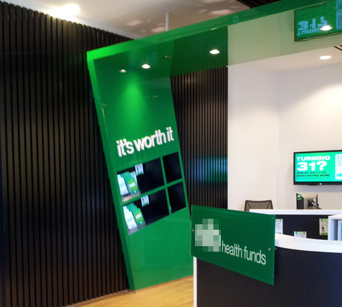
This is the store front of a local health insurer.

The "fashionably" wonky, frozen-in-the-process-of-falling-down wall feature/shelf, with the precariously balanced brochures all clustered down one sloping side, is a complete non sequitur to me. It is trying hard to make a statement; one which I struggle to connect with their brand/industry.
Why wonky, with dynamic tension? Why not dependable, comfortable, safe, calm, friendly accessible? Surely even mega-hipsters would want these qualities when they need medical insurance?
If they can't build a straight wall with functional shelves, can I trust them to deal with my financial matters when I am sick in hospital?